Tutorial: Label with ProgressBar [in a StatusStrip] in Visual Basic
Introduction
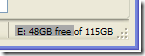 Recently I needed a very simple meter embedded into a
 StatusStrip like the one shown to the right. The ToolStripProgressBar included in Visual Studio 2005 can almost cut it but it does not have the capability to overlay text onto the bar. In this tutorial I walk you through creating a simple progress bar with text by inheriting from the Label control and overriding the OnPaint method. I will then extend this to a StatusStripLabel for addition to a StatusStrip container. I did this using Visual Basic but I'm sure this is easily translated to C#.
Creating the class
Start by creating a new class within your project that inherits the label class:
Public Class LabelWithBar
    Inherits Label

End Class
By inheriting from the Label control we get all the standard Label methods and properties; for example Text, TextAlign, ForeColor, BackColor, Font. After you build your project you should see LabelWithBar appear in your Toolbox. This can be dragged and dropped onto your form and manipulated just like a Label control.
Now add three properties: Value, BarColor, and BarHeight:
Public Property Value() As Integer
    Get
        Return mVal
    End Get

    Set(ByVal Value As Integer)

        ' Make sure that the value does not stray outside the valid range.
        Select Case Value
            Case Is < 0
                mVal = 0
            Case Is > 100
                mVal = 100
            Case Else
                mVal = Value
        End Select

        ' Invalidate the control to get a repaint.
        Me.Invalidate()
    End Set
End Property

Public Property BarColor() As Color
    Get
        Return mbarColor
    End Get

    Set(ByVal Value As Color)
        mbarColor = Value

        ' Invalidate the control to get a repaint.
        Me.Invalidate()
    End Set
End Property

Public Property BarHeight() As Integer
    Get
        Return mbarHeight
    End Get
    Set(ByVal value As Integer)
        Select Case value
            Case Is > Me.Size.Height, Is < 0
                mbarHeight = Me.Size.Height
            Case Else
                mbarHeight = value
        End Select

        ' Invalidate the control to get a repaint.
        Me.Invalidate()
    End Set
End Property
The Value property controls the length of the bar similar to the Value property of a ProgressBar . In my example I've limited the value to be an integer between 0 and 100 representing the percent filled. It is easy enough to extend this to use Maximum and Minimum properties like the ProgressBar but this will do for now. The BarColor property controls the bar's color while the BarHeight property controls the bar height or thickness. The BarHeight is forced to be some value less then the height of the label.
Now we can draw the bar by overriding the OnPaint method:
Protected Overrides Sub OnPaint(ByVal e As PaintEventArgs)

    Dim g As Graphics = e.Graphics

    Dim percent As Decimal = mVal / 100
    Dim brush As SolidBrush = New SolidBrush(BarColor)
    Dim rect As Rectangle = e.ClipRectangle
    Dim height As Integer = mbarHeight

    rect.Width = rect.Width * percent
    If height = 0 Then height = rect.Height

    rect.Y = (rect.Height - height) / 2
    rect.Height = height

    ' Draw bar
    g.FillRectangle(brush, rect)
    MyBase.OnPaint(e)

End Sub
This function first draws a bar with the specified color, height, and width then calls the Label's native OnPaint method to draw the text. Note that if BarHeight is set to 0 the bar defaults to the Label's height.
That is really all you need to be on your way. You can now edit the controls Value, BarColor, and BarHeight properties at design time in Visual Studio's properties window or at runtime in your code.
To improve the custom control it is desirable to tell Visual Studio what the default values are for each property. Do this by adding the default values to each class using the DefaultValue attribute. For the Value and BarHeight properties this means adding <DefaultValue(0)> _ on the line just preceding the property declaration. For the BarColor property we need to do a little casting with <DefaultValue(GetType(Color), "Blue")> _ . You many need to import System.ComponentModel if your project doesn't do so already.
Now the final step is creating a version capable of being added to the a StatusStrip control. All you have to do is repeat the steps above but instead of inheriting from the Label class you inherit from the ToolStripStatusLabel class:
<System.ComponentModel.DesignerCategory("code")> _
<ToolStripItemDesignerAvailability(ToolStripItemDesignerAvailability.StatusStrip)> _
Public Class ToolStripStatusLabelWithBar
    Inherits ToolStripStatusLabel

End Class
The attributes preceding the class instruct visual studio that this class can be embedded in a StatusStrip . Now copy and paste all the code from the the LabelWithBar class to this class, rebuild, and you can now add a ToolStripStatusLabelWithBar control to your StatusStrip control.
The complete code can be downloaded here.
Lessons Learned
While I have created a few custom controls in the past this was my first time delving deeply into the design time attributes. A lot of this was my first time experimenting with design time attributes. Overall this project would have taken less than a day if it wasn't for the following false starts.
In my first attempt at creating the LabelWithBar class I tried to inherit from the ProgressBar control and paint the text on top. I soon found that handling the text alignment, fonts, etc was more difficult than adding a simple bar. In the end it turned out much easier to inherit from the label control and painting a simple rectangle.
In my first attempt at creating the ToolStripStatusLabelWithBar class I tried to inherit from the ToolStripControlHost and add the previously created LabelWithBar class as the embedded control. This proved to be much more difficult then necessary. I struggled for nearly a day trying to get the control to keep the Size and TextAlign properties that were being set at design time. I never could get it to work properly. I suspect that behind the scenes ToolStripControlHost was trying to manage the Size and TextAlign between itself and the LabelWithBar interfering with my efforts to do so. In the end it was much easier to simply cut and paste the properties from the LabelWithBar class into the ToolStripStatusLabelWithBar as shown above.